Handwritten logos – some great examples
The blog posts that I’ve previously written about how famous slogans have come about are continually popular. If you haven’t seen them please check out
- Kentucky Fried Chicken’s Finger licking good
- Kit Kat’s Have a break have a Kit Kat
- Carlsberg’s Probably the best larger in the world
- The famous but no longer in use slogan for the Egg Marketing Board - Go to work on an egg
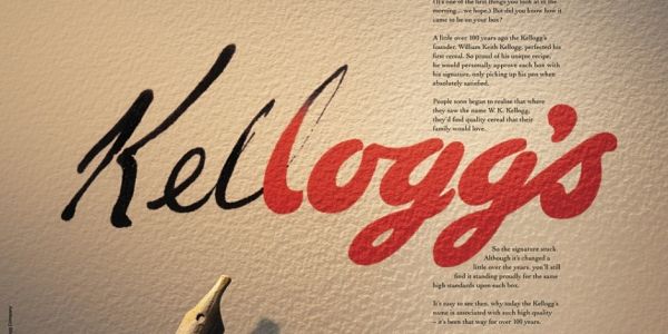
On a similar vein I thought I’d talk about famous logos starting with the red Kellogg’s signature. The information about how this came about was once carried in an ad which explained it like this
“A little over 100 years ago the Kellogg’s founder – William Keith Kellogg – perfected his first cereal. So proud of his unique recipe he would personally approve each box with his signature, only picking up his pen when absolutely satisfied.
People soon began to realise that where they saw the name W.K. Kellogg they’d find quality cereal that their family would love. So the signature stuck.
Although it’s changed a little over the years you’ll still find it proudly standing for the same high standards upon each box.
It’s easy to see then, why today the Kellogg’s name is associated with such high quality – it’s been that way for over 100 years
If it doesn’t say Kellogg’s on the box then it won’t be Kellogg’s in the box"
The company would, of course, have felt the need to spell out the quality of their particular brand when having to compete with supermarket own brands and in this instance they are reminding us that their logo stands for quality thus sowing the seed of doubt in the consumer who may thus be wary about buying an inferior product.
There are other famous handwritten – or cursive – logos with which you will be familiar.
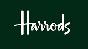
Think about Harrods – for example – this was designed in 1967 and was based on the signature of the store owner Charles Harrods.
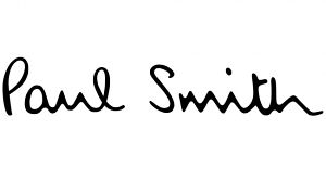
This type of signature works particularly well when the brand and its owner are synonymous – for example as in the case of the high end fashion designer Paul Smith
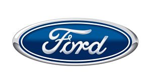
Sometimes the company is named after its founder but there is a curious twist to the signature. The Ford logo, for example, was first developed in 1909 and came about because the company’s First Engineer- Childe Harold Wills - used calligraphy from the business cards he liked to design and print.
The oval was added in 1912 but like Kellogg’s has had enormous longevity with few changes
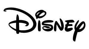
Similarly, you would think that the Disney logo was based on Walt Disney’s own but in fact it didn't come about until 20 years after his death and actually bears very little resemblance to Walt’s actual signature.
What it does resemble is the signature used thousands of time by his employee Hank Porter who used to sign on his behalf to save his boss time and energy! (I love it!)
I hope you've enjoyed this behind the scenes peek at some well known logos?